ML Data Preprocessing & EDA
Cheatsheet Content
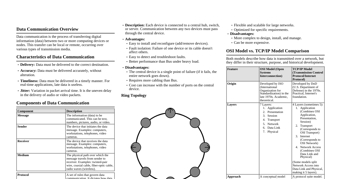
1. Data Loading and Initial Inspection Load Data: import pandas as pd df = pd.read_csv('your_data.csv') Display First/Last Rows: df.head() df.tail() Data Types and Non-Null Counts: df.info() Descriptive Statistics: df.describe() # For numerical columns df.describe(include='object') # For categorical columns df.describe(include='all') # For all columns Shape of Data: df.shape Column Names: df.columns 2. Missing Values 2.1. Detection Total Missing Values per Column: df.isnull().sum() Percentage of Missing Values: (df.isnull().sum() / len(df)) * 100 Visualize Missing Values: import seaborn as sns import matplotlib.pyplot as plt sns.heatmap(df.isnull(), cbar=False) plt.show() 2.2. Treatment Dropping Missing Values: Drop rows with any missing values: df_cleaned = df.dropna() Drop columns with any missing values: df_cleaned = df.dropna(axis=1) Drop rows if all values are NaN: df_cleaned = df.dropna(how='all') Drop columns if all values are NaN: df_cleaned = df.dropna(axis=1, how='all') Imputation (Numerical): Mean imputation: df['col'].fillna(df['col'].mean(), inplace=True) Median imputation: df['col'].fillna(df['col'].median(), inplace=True) Mode imputation: df['col'].fillna(df['col'].mode()[0], inplace=True) Imputation (Categorical): Mode imputation: df['col'].fillna(df['col'].mode()[0], inplace=True) Constant value imputation: df['col'].fillna('Unknown', inplace=True) Forward/Backward Fill: df['col'].fillna(method='ffill', inplace=True) df['col'].fillna(method='bfill', inplace=True) 3. Duplicate Values Detect Duplicates: df.duplicated().sum() # Count duplicate rows df[df.duplicated()] # View duplicate rows Drop Duplicates: df_cleaned = df.drop_duplicates() Drop Duplicates based on specific columns: df_cleaned = df.drop_duplicates(subset=['col1', 'col2']) 4. Outlier Detection and Treatment 4.1. Detection Methods Box Plots: sns.boxplot(x=df['numerical_col']) plt.title('Box Plot for numerical_col') plt.show() Histograms/KDE Plots: sns.histplot(df['numerical_col'], kde=True) plt.title('Histogram with KDE for numerical_col') plt.show() Z-score: For normally distributed data. Outliers typically beyond $\pm 2$ or $\pm 3$ standard deviations. from scipy.stats import zscore df['zscore'] = np.abs(zscore(df['numerical_col'])) outliers_z = df[df['zscore'] > 3] IQR (Interquartile Range): For skewed data. $Q_1 = df['col'].quantile(0.25)$ $Q_3 = df['col'].quantile(0.75)$ $IQR = Q_3 - Q_1$ Lower Bound: $Q_1 - 1.5 \times IQR$ Upper Bound: $Q_3 + 1.5 \times IQR$ Outliers: values outside these bounds. Q1 = df['col'].quantile(0.25) Q3 = df['col'].quantile(0.75) IQR = Q3 - Q1 lower_bound = Q1 - 1.5 * IQR upper_bound = Q3 + 1.5 * IQR outliers_iqr = df[(df['col'] upper_bound)] 4.2. Treatment Methods Trimming (Removal): df_cleaned = df[(df['col'] >= lower_bound) & (df['col'] Capping (Winsorization): df['col'] = np.where(df['col'] > upper_bound, upper_bound, np.where(df['col'] Log Transformation: Can reduce the impact of outliers in skewed data. df['col_log'] = np.log(df['col']) 5. Exploratory Data Analysis (EDA) - Visualization 5.1. Univariate Analysis Histograms (Numerical): plt.figure(figsize=(8, 6)) sns.histplot(df['numerical_col'], bins=30, kde=True) plt.title('Distribution of numerical_col') plt.xlabel('Value') plt.ylabel('Frequency') plt.show() Count Plots (Categorical): plt.figure(figsize=(10, 6)) sns.countplot(y=df['categorical_col'], order=df['categorical_col'].value_counts().index) plt.title('Count of categorical_col Categories') plt.xlabel('Count') plt.ylabel('Category') plt.show() Box Plots (Numerical for Outliers/Distribution): plt.figure(figsize=(8, 6)) sns.boxplot(x=df['numerical_col']) plt.title('Box Plot of numerical_col') plt.show() 5.2. Bivariate Analysis Scatter Plots (Numerical vs. Numerical): plt.figure(figsize=(8, 6)) sns.scatterplot(x='numerical_col1', y='numerical_col2', data=df) plt.title('numerical_col1 vs. numerical_col2') plt.show() Pair Plots (All Numerical): sns.pairplot(df[['num_col1', 'num_col2', 'num_col3']]) plt.show() Bar Plots (Categorical vs. Numerical): plt.figure(figsize=(10, 6)) sns.barplot(x='categorical_col', y='numerical_col', data=df) plt.title('Mean of numerical_col by categorical_col') plt.show() Box Plots (Categorical vs. Numerical): plt.figure(figsize=(10, 6)) sns.boxplot(x='categorical_col', y='numerical_col', data=df) plt.title('Distribution of numerical_col by categorical_col') plt.show() Heatmaps (Categorical vs. Categorical - using crosstab): ct = pd.crosstab(df['cat_col1'], df['cat_col2']) plt.figure(figsize=(8, 6)) sns.heatmap(ct, annot=True, fmt='d', cmap='Blues') plt.title('Crosstab of cat_col1 and cat_col2') plt.show() 5.3. Multivariate Analysis Correlation Matrix Heatmap (Numerical): plt.figure(figsize=(10, 8)) corr_matrix = df.corr(numeric_only=True) sns.heatmap(corr_matrix, annot=True, cmap='coolwarm', fmt=".2f") plt.title('Correlation Matrix') plt.show() Pair Plots with Hue: sns.pairplot(df, hue='target_col', vars=['feat1', 'feat2', 'feat3']) plt.show() 6. Feature Engineering (Brief) Creating New Features: df['new_feature'] = df['col1'] + df['col2'] Binning Numerical Data: df['binned_col'] = pd.cut(df['numerical_col'], bins=5, labels=False) Handling Date/Time Features: df['date_col'] = pd.to_datetime(df['date_col']) df['year'] = df['date_col'].dt.year df['month'] = df['date_col'].dt.month df['day_of_week'] = df['date_col'].dt.dayofweek 7. Encoding Categorical Variables (Brief) One-Hot Encoding: df_encoded = pd.get_dummies(df, columns=['categorical_col'], drop_first=True) Label Encoding: from sklearn.preprocessing import LabelEncoder le = LabelEncoder() df['categorical_col_encoded'] = le.fit_transform(df['categorical_col']) 8. Scaling Numerical Features (Brief) Standard Scaling: $X_{scaled} = (X - \mu) / \sigma$ from sklearn.preprocessing import StandardScaler scaler = StandardScaler() df[['num_col1', 'num_col2']] = scaler.fit_transform(df[['num_col1', 'num_col2']]) Min-Max Scaling: $X_{scaled} = (X - X_{min}) / (X_{max} - X_{min})$ from sklearn.preprocessing import MinMaxScaler scaler = MinMaxScaler() df[['num_col1', 'num_col2']] = scaler.fit_transform(df[['num_col1', 'num_col2']])