Power BI Data Visualization
Cheatsheet Content
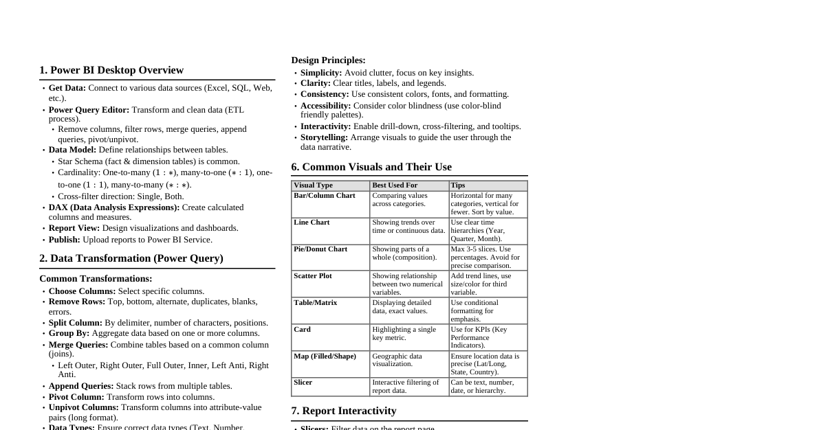
1. Power BI Desktop Overview Get Data: Connect to various data sources (Excel, SQL, Web, etc.). Power Query Editor: Transform and clean data (ETL process). Remove columns, filter rows, merge queries, append queries, pivot/unpivot. Data Model: Define relationships between tables. Star Schema (fact & dimension tables) is common. Cardinality: One-to-many ($1:*$), many-to-one ($*:1$), one-to-one ($1:1$), many-to-many ($*:*$). Cross-filter direction: Single, Both. DAX (Data Analysis Expressions): Create calculated columns and measures. Report View: Design visualizations and dashboards. Publish: Upload reports to Power BI Service. 2. Data Transformation (Power Query) Common Transformations: Choose Columns: Select specific columns. Remove Rows: Top, bottom, alternate, duplicates, blanks, errors. Split Column: By delimiter, number of characters, positions. Group By: Aggregate data based on one or more columns. Merge Queries: Combine tables based on a common column (joins). Left Outer, Right Outer, Full Outer, Inner, Left Anti, Right Anti. Append Queries: Stack rows from multiple tables. Pivot Column: Transform rows into columns. Unpivot Columns: Transform columns into attribute-value pairs (long format). Data Types: Ensure correct data types (Text, Number, Date/Time, Boolean). 3. Data Modeling & Relationships Key Concepts: Fact Table: Contains quantitative data (measures) and foreign keys to dimension tables. Dimension Table: Contains descriptive attributes. Relationships: Connect tables using common columns. Active vs. Inactive relationships. Bidirectional filtering can impact performance and create ambiguity. Calculated Columns: Added to the model, computed row-by-row. Column = [Column1] * [Column2] Age = DATEDIFF([Birth Date], TODAY(), YEAR) Measures: Dynamic calculations aggregated at query time, used in visuals. Total Sales = SUM(Sales[Amount]) Avg Sales = CALCULATE(AVERAGE(Sales[Amount]), ALL(Sales)) Sales YTD = TOTALYTD(SUM(Sales[Amount]), 'Date'[Date]) 4. DAX Fundamentals Common Functions: Aggregation: SUM(), AVERAGE(), MIN(), MAX(), COUNT(), COUNTROWS(), DISTINCTCOUNT(). Iterators: SUMX(), AVERAGEX(), MAXX(), MINX(). Total Revenue = SUMX(Sales, Sales[Quantity] * Sales[Price]) Logical: IF(), AND(), OR(), NOT(). Filter Context Modification: CALCULATE(): Changes the filter context for an expression. Sales California = CALCULATE([Total Sales], 'Geography'[State] = "California") ALL(): Removes all filters from a table or column. ALLEXCEPT(): Removes all filters except those on specified columns. FILTER(): Applies a filter to a table expression. High Value Customers = CALCULATE(DISTINCTCOUNT(Customers[CustomerID]), FILTER(Customers, Customers[Total Orders] > 10)) Time Intelligence: DATEADD(), SAMEPERIODLASTYEAR(), TOTALYTD(), DATESBETWEEN(). 5. Visualization Best Practices Choosing the Right Visual: Comparison: Bar charts, Column charts, Line charts. Composition: Stacked bar/column charts, Pie charts (use sparingly, for few categories). Distribution: Histograms, Scatter plots (for two numerical variables). Relationship: Scatter plots, Bubble charts. Trend over Time: Line charts, Area charts. Geographic Data: Map visuals. Key Metrics: Card visual, Gauge. Design Principles: Simplicity: Avoid clutter, focus on key insights. Clarity: Clear titles, labels, and legends. Consistency: Use consistent colors, fonts, and formatting. Accessibility: Consider color blindness (use color-blind friendly palettes). Interactivity: Enable drill-down, cross-filtering, and tooltips. Storytelling: Arrange visuals to guide the user through the data narrative. 6. Common Visuals and Their Use Visual Type Best Used For Tips Bar/Column Chart Comparing values across categories. Horizontal for many categories, vertical for fewer. Sort by value. Line Chart Showing trends over time or continuous data. Use clear time hierarchies (Year, Quarter, Month). Pie/Donut Chart Showing parts of a whole (composition). Max 3-5 slices. Use percentages. Avoid for precise comparison. Scatter Plot Showing relationship between two numerical variables. Add trend lines, use size/color for third variable. Table/Matrix Displaying detailed data, exact values. Use conditional formatting for emphasis. Card Highlighting a single key metric. Use for KPIs (Key Performance Indicators). Map (Filled/Shape) Geographic data visualization. Ensure location data is precise (Lat/Long, State, Country). Slicer Interactive filtering of report data. Can be text, number, date, or hierarchy. 7. Report Interactivity Slicers: Filter data on the report page. Filters Pane: Page-level, visual-level, and report-level filters. Drill Through: Navigate from one report page to another, passing filter context. Bookmarks: Save and navigate to specific states of a report page. Tooltips: Provide additional information on hover. Custom tooltips can be created with other report pages. Cross-filtering/Cross-highlighting: Visuals interact with each other by default. Adjust interaction behavior.